Preview Montrex Slab Regular Expanded Low Display font with your text


Montrex Slab Regular Expanded Low Display font
Publisher
MyFonts.com
License
$ Commercial
Date added
Jul 02 2026
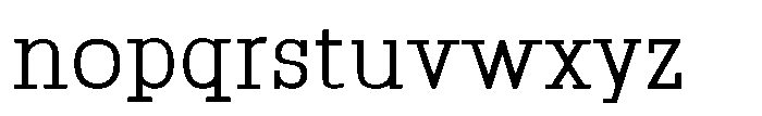
Expanded slab serif font with low contrast and mechanical, monospaced style.
A slab serif font with expanded letterforms and low contrast in stroke thickness. The characters have a mechanical, monospaced feel with clear, rectangular serifs and consistent stroke widths. The font features a regular weight and normal character spacing, with a slightly taller cap height relative to the x-height. The ascenders and descenders are moderately proportioned, contributing to a balanced and readable appearance.
Technical documents, coding interfaces, signage, vintage-inspired branding, editorial headlines.
Headlines, Body text, Technical displays
Download Montrex Slab Regular Expanded Low Display font.
Technical documents, coding interfaces, signage, vintage-inspired branding, editorial headlines.
Headlines, Body text, Technical displays
Category
Bold
No
Italic
No
Weight
Regular
Width
Expanded
Character spacing
Normal
Line height
Normal
Contrast
Low
Overall style
Mechanical, Vintage
X height
Medium
Cap height
Help your fellow font-seekers if you think you can recognize the font. Earn some good karma by doing it :-) Answer & Help

Yet sometimes the images are very complex, so other users need a bit of help.
If you recognize the font from the samples posted here don't be shy and help a fellow designer.
Thousands of designers (famous or not) use the image font detection system to find a font or similar free fonts from an image. Although we have the largest database of fonts, the search for a font from an image gets mixed results like the image above.
Recognize the font? Browse forumHave a font you want to use on the web?
Webfont Generatorin seconds.