Preview Kornesia Contrast Kornesia Cntr Thin Condensed font with your text







Kornesia Contrast Kornesia Cntr Thin Condensed font
Publisher
MyFonts.com
License
$ Commercial
Date added
Jul 03 2026
Thin, condensed serif font with high contrast and elegant proportions.
A highly condensed serif font with thin strokes and high contrast between thick and thin elements. The characters have a tall, narrow appearance with delicate serifs and a refined, elegant style. The lowercase letters feature noticeable ascenders and descenders, contributing to a sophisticated and classic look.
Editorial headlines, luxury branding, fashion magazines, invitations, and elegant packaging.
Headlines, Logos, Display text
Download Kornesia Contrast Kornesia Cntr Thin Condensed font.
Editorial headlines, luxury branding, fashion magazines, invitations, and elegant packaging.
Headlines, Logos, Display text
Category
Bold
No
Italic
No
Weight
Light
Width
Condensed
Character spacing
Tight
Line height
Normal
Contrast
High
Overall style
Classic, Elegant
X height
Cap height
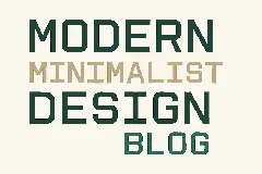
Help your fellow font-seekers if you think you can recognize the font. Earn some good karma by doing it :-) Answer & Help
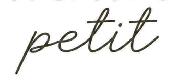
Yet sometimes the images are very complex, so other users need a bit of help.
If you recognize the font from the samples posted here don't be shy and help a fellow designer.
Thousands of designers (famous or not) use the image font detection system to find a font or similar free fonts from an image. Although we have the largest database of fonts, the search for a font from an image gets mixed results like the image above.
Recognize the font? Browse forumHave a font you want to use on the web?
Webfont Generatorin seconds.