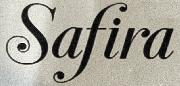
Preview Coldetica Serif Regular font with your text


Coldetica Serif Regular font
Publisher
MyFonts.com
License
$ Commercial
Date added
Jul 01 2026
Classic serif font with moderate contrast and balanced proportions.
A classic serif font with moderate contrast in stroke thickness, featuring traditional serif terminals and a balanced structure. The characters have a slightly condensed width with normal character spacing and line height. The font exhibits a clear distinction between thick and thin strokes, with elegant curves and sharp serifs, suitable for formal and professional use.
Editorial design, books, academic papers, formal invitations, branding for professional services.
Body text, Headlines, Formal documents
Download Coldetica Serif Regular font.
Editorial design, books, academic papers, formal invitations, branding for professional services.
Body text, Headlines, Formal documents
Category
Bold
No
Italic
No
Weight
Regular
Width
Condensed
Character spacing
Normal
Line height
Normal
Contrast
Medium
Overall style
Classic
X height
Medium
Cap height
Medium
Proposed projects
Editorial design, books, academic papers, formal invitations, branding for professional services.
Use case
Body text, Headlines, Formal documents
Ascender descender ratio

Help your fellow font-seekers if you think you can recognize the font. Earn some good karma by doing it :-) Answer & Help
Yet sometimes the images are very complex, so other users need a bit of help.
If you recognize the font from the samples posted here don't be shy and help a fellow designer.
Thousands of designers (famous or not) use the image font detection system to find a font or similar free fonts from an image. Although we have the largest database of fonts, the search for a font from an image gets mixed results like the image above.
Recognize the font? Browse forumHave a font you want to use on the web?
Webfont Generatorin seconds.