Preview Balium Extra Bold Oblique Bad Kerning font with your text


Balium Extra Bold Oblique Bad Kerning font
Publisher
MyFonts.com
License
$ Commercial
Date added
Jul 02 2026
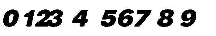
Extra-bold oblique sans-serif with heavy weight and poor kerning.
A heavy, extra-bold oblique sans-serif font with a strong slant and noticeable bad kerning. The characters are thick and rounded with a consistent stroke weight, designed for impactful display use.
Suitable for bold headlines, posters, logos, and branding where strong emphasis is needed, but kerning adjustments are recommended.
Headlines, Logos, Posters
Download Balium Extra Bold Oblique Bad Kerning font.
Suitable for bold headlines, posters, logos, and branding where strong emphasis is needed, but kerning adjustments are recommended.
Headlines, Logos, Posters
Category
Bold
Yes
Italic
Yes
Weight
Bold
Width
Normal
Character spacing
Tight
Line height
Normal
Contrast
Low
Overall style
Modern, Display
X height
Cap height
High
Help your fellow font-seekers if you think you can recognize the font. Earn some good karma by doing it :-) Answer & Help
Yet sometimes the images are very complex, so other users need a bit of help.
If you recognize the font from the samples posted here don't be shy and help a fellow designer.
Thousands of designers (famous or not) use the image font detection system to find a font or similar free fonts from an image. Although we have the largest database of fonts, the search for a font from an image gets mixed results like the image above.
Recognize the font? Browse forumHave a font you want to use on the web?
Webfont Generatorin seconds.