Preview with Your Text

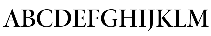
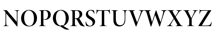
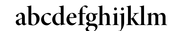
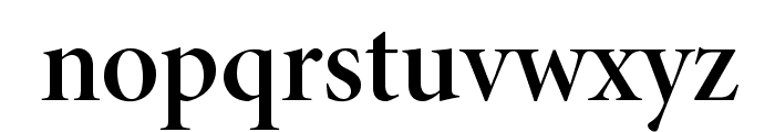
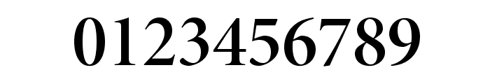
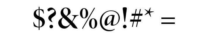
MinionPro-SemiboldDisp font
Publisher
from Adobe Font Folio 11
License
$ Commercial
Date added
Jan 20 2017
A semi-bold serif font with a classic and elegant style.
This font features a classic serif style with semi-bold weight, offering a balanced and elegant appearance. The characters are well-defined with moderate contrast in stroke thickness, providing a clear and professional look.
Ideal for editorial design, book covers, formal invitations, and branding projects that require a sophisticated touch.
Headlines, Body text, Logos
Balanced
Download MinionPro-SemiboldDisp font. MinionPro-SemiboldDisp by ? 1990, 1991, 1992, 1994, 1997, 1998, 2000, 2002, 2004 Adobe Systems Incorporated. All rights reserved. Protected by U.S. Patents D371,799; D497,175; D497,630.
Ideal for editorial design, book covers, formal invitations, and branding projects that require a sophisticated touch.
Headlines, Body text, Logos
Balanced
Category
Bold
Yes
Italic
No
Weight
Bold
Width
Normal
Character spacing
Normal
Line height
Normal
Contrast
Medium
Overall style
Classic
X height
Medium
Cap height
High
Proposed projects
Ideal for editorial design, book covers, formal invitations, and branding projects that require a sophisticated touch.
Use case
Headlines, Body text, Logos
Ascender descender ratio
Balanced


Help your fellow font-seekers if you think you can recognize the font. Earn some good karma by doing it :-) Answer & Help
Yet sometimes the images are very complex, so other users need a bit of help.
If you recognize the font from the samples posted here don't be shy and help a fellow designer.
Thousands of designers (famous or not) use the image font detection system to find a font or similar free fonts from an image. Although we have the largest database of fonts, the search for a font from an image gets mixed results like the image above.