Preview with Your Text


Why, Oh Why font
Publisher
License
$ Free for personal use
Date added
Jan 09 2017
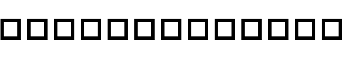
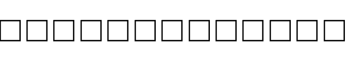
A geometric, monospaced font with uniform square outlines for each character.
This design features uniform, bold, square-shaped glyphs with consistent stroke thickness, creating a geometric and monospaced appearance. Each character is represented as a perfect square outline, giving a highly abstract and modular look.
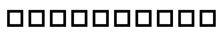
Pixel art, modular posters, experimental digital interfaces, abstract branding, tech-themed graphics.
Logos, Posters, Experimental headlines, Digital art
Download Why, Oh Why font. Why, Oh Why by ?2001 Frogii
Pixel art, modular posters, experimental digital interfaces, abstract branding, tech-themed graphics.
Logos, Posters, Experimental headlines, Digital art
(Frogii`s Fonts)
Category
Bold
Yes
Italic
No
Weight
Bold
Width
Condensed
Character spacing
Normal
Line height
Tall
Contrast
Low
Overall style
Modern, Abstract, Minimalist
X height
Cap height
Similar Free Fonts for Why, Oh Why
DLDesigns6 Font

$ Free > Personal Use
Festival of Lights Font
$ Free > Personal Use
Similar fonts for Why, Oh Why from Adobe.com
BlazefaceHangeulv0.5 Heavy Font
$ Commercial > Adobe.com
FederalReserveNote Regular Font

$ Commercial > Adobe.com
Similar fonts for Why, Oh Why from MyFonts.com
Bell MT Regular Expert Font

$ Commercial > MyFonts.com
Wood Sans Rough Icons Font

$ Commercial > MyFonts.com
Similar fonts for Why, Oh Why from CreativeMarket.com
WideDisplay Bold Ribbon otf (700) Font

$ Commercial > CreativeMarket.com
Oboe Solid Framed Regular otf (400) Font

$ Commercial > CreativeMarket.com


Help your fellow font-seekers if you think you can recognize the font. Earn some good karma by doing it :-) Answer & Help
Yet sometimes the images are very complex, so other users need a bit of help.
If you recognize the font from the samples posted here don't be shy and help a fellow designer.
Thousands of designers (famous or not) use the image font detection system to find a font or similar free fonts from an image. Although we have the largest database of fonts, the search for a font from an image gets mixed results like the image above.