Preview with Your Text


Later regular ttf (400) font
Publisher
CreativeMarket.com
License
$ Commercial
Date added
Mar 31 2022
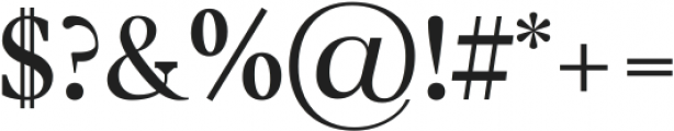
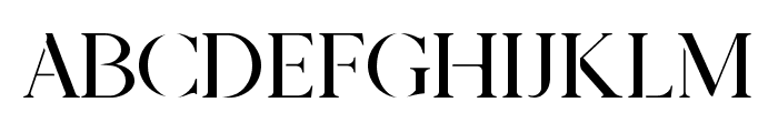
A classic serif font with elegant curves and moderate contrast.
This font features a classic serif style with elegant curves and a moderate stroke contrast. The characters are well-proportioned, with distinct serifs that enhance readability. The numerals are slightly taller than the lowercase letters, providing a balanced appearance.
Ideal for editorial design, book publishing, and formal invitations.
Body text, Headlines
Balanced
Download Later regular ttf (400) font. Later regular ttf (400) by
Ideal for editorial design, book publishing, and formal invitations.
Body text, Headlines
Balanced
Category
Bold
No
Italic
No
Weight
Regular
Width
Normal
Character spacing
Normal
Line height
Normal
Contrast
Medium
Overall style
Classic
X height
Medium
Cap height
High
Proposed projects
Ideal for editorial design, book publishing, and formal invitations.
Use case
Body text, Headlines
Ascender descender ratio
Balanced
Similar Free Fonts for Later regular ttf (400)
Vincentio Regular Font


$ Free > Personal Use
Prestige Signature Serif - Demo Font
$ Free > Personal Use
Similar fonts for Later regular ttf (400) from Adobe.com
Dejanire Jewel Regular Font
$ Commercial > Adobe.com
Dejanire Text Regular Font
$ Commercial > Adobe.com
Similar fonts for Later regular ttf (400) from MyFonts.com
Thorndale Std Regular Font

$ Commercial > MyFonts.com
Mikaway BQ Cond Reg Font

$ Commercial > MyFonts.com
Similar fonts for Later regular ttf (400) from CreativeMarket.com
Later regular ttf (400) Font
$ Commercial > CreativeMarket.com
Later regular otf (400) Font

$ Commercial > CreativeMarket.com
![]()

Help your fellow font-seekers if you think you can recognize the font. Earn some good karma by doing it :-) Answer & Help
Yet sometimes the images are very complex, so other users need a bit of help.
If you recognize the font from the samples posted here don't be shy and help a fellow designer.
Thousands of designers (famous or not) use the image font detection system to find a font or similar free fonts from an image. Although we have the largest database of fonts, the search for a font from an image gets mixed results like the image above.