Preview with Your Text


Equalizer Thin font
Publisher
Creative Fabrica
License
$ Commercial
Date added
Oct 08 2021
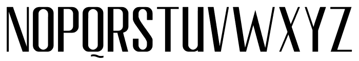
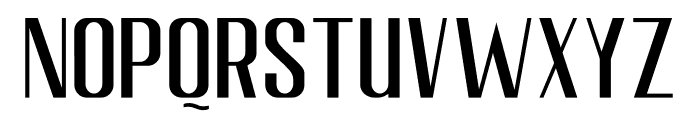
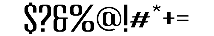
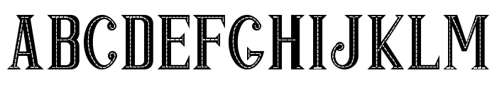
A modern, geometric font with tall, narrow characters and uniform stroke width.
This font features a modern, geometric design with clean, straight lines and a uniform stroke width. The characters are tall and narrow, giving it a sleek and contemporary appearance. The uppercase and lowercase letters maintain a consistent style, with slightly rounded corners adding a subtle softness.
Ideal for branding, headlines, and editorial design where a modern and sleek look is desired.
Headlines, Logos
Balanced
Download Equalizer Thin font. Equalizer Thin by Equalizer Thin ? Doehantz Studio. 2021. All Rights Reserved
Ideal for branding, headlines, and editorial design where a modern and sleek look is desired.
Headlines, Logos
Balanced
Category
Bold
No
Italic
No
Weight
Light
Width
Condensed
Character spacing
Normal
Line height
Tall
Contrast
Low
Overall style
Modern
X height
Medium
Cap height
High
Similar Free Fonts for Equalizer Thin
Swistblnk Moalang Melintang Font

$ Free > Personal Use
POP & JAZZ Font
$ Free > Personal Use
Similar fonts for Equalizer Thin from Adobe.com
Farmhand Sans Regular Font

$ Commercial > Adobe.com
Poster Gothic ExCond ATF Regular Font

$ Commercial > Adobe.com
Similar fonts for Equalizer Thin from MyFonts.com
No Parking JNL Font

$ Commercial > MyFonts.com
Harsey Sans One Font

$ Commercial > MyFonts.com
Similar fonts for Equalizer Thin from CreativeMarket.com
LS Harsey Sans One otf (400) Font

$ Commercial > CreativeMarket.com
Moalang Pro otf (400) Font

$ Commercial > CreativeMarket.com


Help your fellow font-seekers if you think you can recognize the font. Earn some good karma by doing it :-) Answer & Help
Yet sometimes the images are very complex, so other users need a bit of help.
If you recognize the font from the samples posted here don't be shy and help a fellow designer.
Thousands of designers (famous or not) use the image font detection system to find a font or similar free fonts from an image. Although we have the largest database of fonts, the search for a font from an image gets mixed results like the image above.