Preview with Your Text

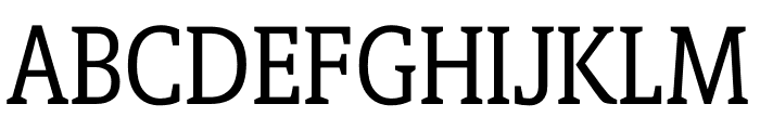
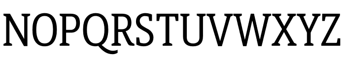
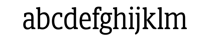
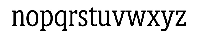


Berlingske Slab Display font
Publisher
playtype.com
License
$ Commercial
Date added
Jan 10 2019
A modern slab serif font with strong geometric serifs and balanced weight.
This font features strong, geometric slab serifs with a modern touch. The characters are well-defined with a balanced weight, providing a clean and professional appearance. The uppercase letters are bold and commanding, while the lowercase letters maintain readability with a slightly condensed form.
Ideal for headlines, branding, editorial design, and signage.
Headlines, Logos
Balanced
Download Berlingske Slab Display font. Berlingske Slab Display by Copyright (c) 2013 by Jonas Hecksher, Playtype, e-Types AS. All rights reserved.
Ideal for headlines, branding, editorial design, and signage.
Headlines, Logos
Balanced
Category
Bold
Yes
Italic
No
Weight
Bold
Width
Normal
Character spacing
Normal
Line height
Normal
Contrast
Medium
Overall style
Modern
X height
Medium
Cap height
High


Help your fellow font-seekers if you think you can recognize the font. Earn some good karma by doing it :-) Answer & Help
Yet sometimes the images are very complex, so other users need a bit of help.
If you recognize the font from the samples posted here don't be shy and help a fellow designer.
Thousands of designers (famous or not) use the image font detection system to find a font or similar free fonts from an image. Although we have the largest database of fonts, the search for a font from an image gets mixed results like the image above.