Keycap font, so samples are a bit fuzzy.
7 years ago
2 replies (7 years ago)
Solved
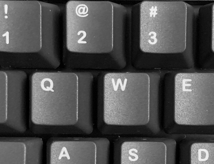
This is a keyboard keycap font, so hard to process automatically, and of course it's rather small print with somewhat rough edges. I will point out that it appears that it is part of the design--and not just a result of the printing process--that the stroke ends are rounded. That said, it is still a fairly "professional-looking" typeface, and not cartoony. Thanks for any help!
7 years ago
Wow, @BogdanC ... you are good. Impressive. Thanks to that capital "Q", I have no doubt you are right. Thanks so very much!
Our system helps everyday thousands of designers (famous or not) to find the fonts they need to complete their work. Using a database of 1,200,000 fonts the automatic font finder system identifies the font from images.
Yet sometimes the images are very complex, so other users need a bit of help.
If you recognize the font from the samples posted here don't be shy and help a fellow designer.
If you need help, first try the font finder. At the end of the process if the results are bad you will find a link that lets you post the image to the forum so other users can help you.