


Niagara Solid font
Publisher
from Microsoft Office 2016
License
$ Commercial
Date added
Jan 20 2017
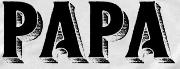
A tall, narrow font with strong vertical emphasis and minimal serifs.
This font features tall, narrow characters with a strong vertical emphasis and minimal serifs. The strokes are consistent in width, giving it a solid and bold appearance. The uppercase letters are particularly elongated, while the lowercase letters maintain a similar height ratio.
Ideal for posters, headlines, and branding projects that require a bold and impactful look.
Headlines, Logos
High
Download Niagara Solid font. Niagara Solid by Copyright (c) 1994, Tobias Frere-Jones. Designed by Tobias Frere-Jones. Produced by The Font Bureau, Inc. All rights reserved.
Ideal for posters, headlines, and branding projects that require a bold and impactful look.
Headlines, Logos
High
Category
Bold
Yes
Italic
No
Weight
Bold
Width
Condensed
Character spacing
Tight
Line height
Normal
Contrast
Low
Overall style
Modern
X height
Medium
Cap height
High
Similar Free Fonts for Niagara Solid
Ducados Font


$ Free > Personal Use
LaTribuneCP Font

$ Free > Personal Use
Similar fonts for Niagara Solid from Adobe.com
Niagara Regular Font

$ Commercial > Adobe.com
Niagara Engraved Regular Font

$ Commercial > Adobe.com
Similar fonts for Niagara Solid from MyFonts.com
Cloudbuster Regular Font

$ Commercial > MyFonts.com
Denso Serif High Bold Font

$ Commercial > MyFonts.com
Similar fonts for Niagara Solid from CreativeMarket.com
FANFARE otf (400) Font

$ Commercial > CreativeMarket.com
Niagara Solid ttf (400) Font

$ Commercial > CreativeMarket.com
![]()
Help your fellow font-seekers if you think you can recognize the font. Earn some good karma by doing it :-) Answer & Help
Yet sometimes the images are very complex, so other users need a bit of help.
If you recognize the font from the samples posted here don't be shy and help a fellow designer.
Thousands of designers (famous or not) use the image font detection system to find a font or similar free fonts from an image. Although we have the largest database of fonts, the search for a font from an image gets mixed results like the image above.