Preview with Your Text


Why Square Std Thin font
Publisher
MyFonts.com
License
$ Commercial
Date added
Dec 05 2016
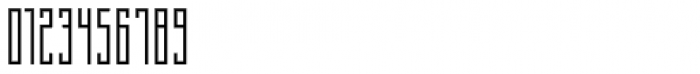
A thin, geometric font with a modern and minimalist design.
This font features a geometric and modern design with a thin, square-like structure. The characters are tall and narrow, giving it a sleek and contemporary appearance. The uniform stroke width and sharp angles contribute to its clean and minimalist style.
Ideal for modern branding, tech-related projects, and minimalist design layouts.
Headlines, Logos
Balanced
Download Why Square Std Thin font.
Ideal for modern branding, tech-related projects, and minimalist design layouts.
Headlines, Logos
Balanced
Category
Bold
No
Italic
No
Weight
Light
Width
Condensed
Character spacing
Normal
Line height
Tall
Contrast
Low
Overall style
Modern
X height
Medium
Cap height
High
Similar Free Fonts for Why Square Std Thin
BertaDrug Font


$ Free > Personal Use
Thin Cool Font

$ Free > Personal Use
Similar fonts for Why Square Std Thin from Adobe.com
Alternate Gothic Compressed ATF Semilight Font

$ Commercial > Adobe.com
Alternate Gothic Compressed ATF Light Font

$ Commercial > Adobe.com
Similar fonts for Why Square Std Thin from MyFonts.com
Why Square IN Std Thin Font

$ Commercial > MyFonts.com
Why Square Cyrillic Std Thin Font

$ Commercial > MyFonts.com
Similar fonts for Why Square Std Thin from CreativeMarket.com
Reformer Semi Bold otf (600) Font

$ Commercial > CreativeMarket.com
Hawkes Light Variable Width otf (300) Font

$ Commercial > CreativeMarket.com
![]()
Help your fellow font-seekers if you think you can recognize the font. Earn some good karma by doing it :-) Answer & Help
Yet sometimes the images are very complex, so other users need a bit of help.
If you recognize the font from the samples posted here don't be shy and help a fellow designer.
Thousands of designers (famous or not) use the image font detection system to find a font or similar free fonts from an image. Although we have the largest database of fonts, the search for a font from an image gets mixed results like the image above.