Preview with Your Text


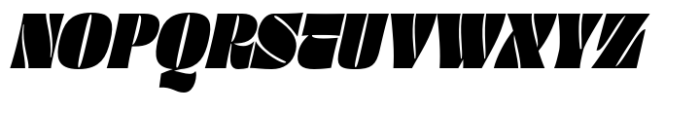


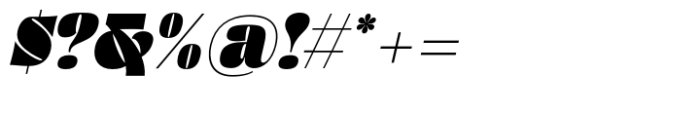
Thick Thinks Slant font
Publisher
MyFonts.com
License
$ Commercial
Date added
Nov 21 2025
Bold, slanted serif font with thick strokes and sharp diagonal cuts.
A bold, condensed serif font with a strong slant and thick strokes. The characters feature sharp diagonal cuts and a high contrast between thick and thin elements, giving a dynamic and aggressive appearance. The font includes uppercase, lowercase, numerals, and various symbols.
Ideal for headlines, logos, posters, and branding that require a strong, impactful presence.
Headlines, Logos, Posters
Download Thick Thinks Slant font.
Ideal for headlines, logos, posters, and branding that require a strong, impactful presence.
Headlines, Logos, Posters
Category
Bold
Yes
Italic
Yes
Weight
Bold
Width
Condensed
Character spacing
Tight
Line height
Normal
Contrast
High
Overall style
Modern, Dynamic
X height
Medium
Cap height
![]()

Help your fellow font-seekers if you think you can recognize the font. Earn some good karma by doing it :-) Answer & Help
Yet sometimes the images are very complex, so other users need a bit of help.
If you recognize the font from the samples posted here don't be shy and help a fellow designer.
Thousands of designers (famous or not) use the image font detection system to find a font or similar free fonts from an image. Although we have the largest database of fonts, the search for a font from an image gets mixed results like the image above.