Preview with Your Text


Thick Thinks Regular font
Publisher
MyFonts.com
License
$ Commercial
Date added
Nov 21 2025
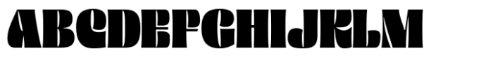
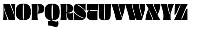
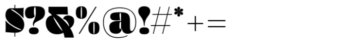
Bold, condensed serif font with high contrast and dramatic styling.
A bold, condensed serif font with high contrast and thick strokes, featuring dramatic curves and sharp edges. The uppercase letters are heavy and blocky with unique cut-out details, while the lowercase letters maintain a strong presence with thick serifs and rounded forms. Numerals and symbols follow the same bold, condensed style with distinctive shapes.
Ideal for headlines, posters, logos, branding, and display use where strong visual impact is needed.
Headlines, Logos, Posters, Branding
Download Thick Thinks Regular font.
Ideal for headlines, posters, logos, branding, and display use where strong visual impact is needed.
Headlines, Logos, Posters, Branding
Category
Bold
Yes
Italic
No
Weight
Bold
Width
Condensed
Character spacing
Tight
Line height
Normal
Contrast
High
Overall style
Decorative, Vintage
X height
Medium
Cap height
![]()
Help your fellow font-seekers if you think you can recognize the font. Earn some good karma by doing it :-) Answer & Help
Yet sometimes the images are very complex, so other users need a bit of help.
If you recognize the font from the samples posted here don't be shy and help a fellow designer.
Thousands of designers (famous or not) use the image font detection system to find a font or similar free fonts from an image. Although we have the largest database of fonts, the search for a font from an image gets mixed results like the image above.