Preview with Your Text


Sharp Sans Display No. 2 Sm Bold font
Publisher
MyFonts.com
License
$ Commercial
Date added
Nov 30 2025
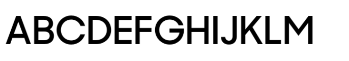
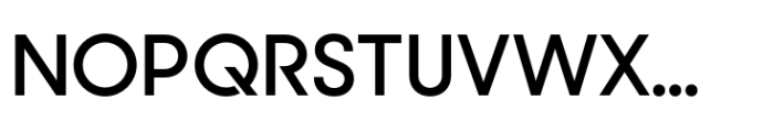
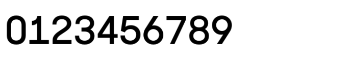
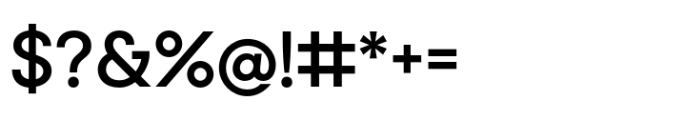
Bold, sharp-edged sans-serif display font with geometric influences.
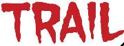
A clean, modern sans-serif display font with sharp edges and geometric shapes. The characters have consistent stroke weight and a slightly condensed width, featuring distinct angular cuts on some letters like Q and R. The lowercase letters are rounded with a contemporary feel, and the overall design is bold and clear.
Branding, headlines, posters, editorial design, digital interfaces.
Headlines, Logos, Display text
Download Sharp Sans Display No. 2 Sm Bold font.
Branding, headlines, posters, editorial design, digital interfaces.
Headlines, Logos, Display text
Category
Bold
Yes
Italic
No
Weight
Bold
Width
Condensed
Character spacing
Normal
Line height
Normal
Contrast
Overall style
Modern
X height
Cap height
High
![]()
Help your fellow font-seekers if you think you can recognize the font. Earn some good karma by doing it :-) Answer & Help
Yet sometimes the images are very complex, so other users need a bit of help.
If you recognize the font from the samples posted here don't be shy and help a fellow designer.
Thousands of designers (famous or not) use the image font detection system to find a font or similar free fonts from an image. Although we have the largest database of fonts, the search for a font from an image gets mixed results like the image above.