Preview with Your Text


Proximity Pe Regular font
Publisher
MyFonts.com
License
$ Commercial
Date added
Dec 09 2025
Classic serif font with moderate contrast and traditional styling.
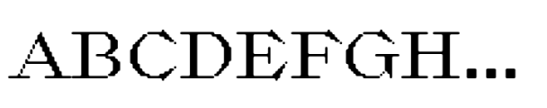
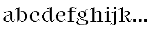
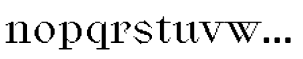
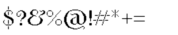
A serif font with moderate contrast in stroke thickness, featuring classic and slightly condensed letterforms with sharp serifs and a traditional style. The characters have a balanced ascender and descender height, with a clear distinction between uppercase and lowercase forms.
Suitable for editorial design, book typography, formal invitations, and branding that requires a timeless and professional appearance.
Body text, Headlines, Formal documents
Download Proximity Pe Regular font.
Suitable for editorial design, book typography, formal invitations, and branding that requires a timeless and professional appearance.
Body text, Headlines, Formal documents
Category
Bold
No
Italic
No
Weight
Regular
Width
Condensed
Character spacing
Normal
Line height
Normal
Contrast
Medium
Overall style
Classic
X height
Medium
Cap height
Proposed projects
Suitable for editorial design, book typography, formal invitations, and branding that requires a timeless and professional appearance.
Use case
Body text, Headlines, Formal documents
Ascender descender ratio
![]()

Help your fellow font-seekers if you think you can recognize the font. Earn some good karma by doing it :-) Answer & Help
Yet sometimes the images are very complex, so other users need a bit of help.
If you recognize the font from the samples posted here don't be shy and help a fellow designer.
Thousands of designers (famous or not) use the image font detection system to find a font or similar free fonts from an image. Although we have the largest database of fonts, the search for a font from an image gets mixed results like the image above.