Preview with Your Text


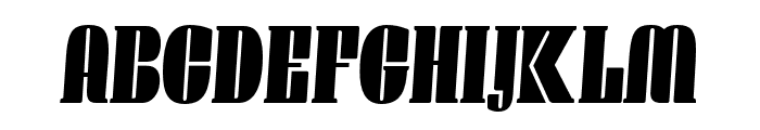
Manometer Serif Low Oblique font
Publisher
MyFonts.com
License
$ Commercial
Date added
Mar 05 2025
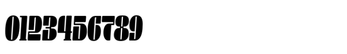
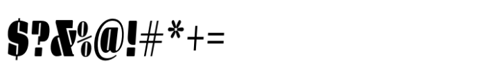
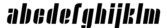
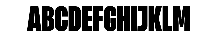
Bold, oblique serif font with wide characters.
This font features bold, wide characters with a distinct oblique slant. The serifs are pronounced, adding a classic touch to the otherwise modern style. The strokes are thick, providing a strong visual impact.
Ideal for headlines, posters, and branding projects that require a strong and impactful typeface.
Headlines, Logos
Balanced
Download Manometer Serif Low Oblique font.
Ideal for headlines, posters, and branding projects that require a strong and impactful typeface.
Headlines, Logos
Balanced
Category
Bold
Yes
Italic
Yes
Weight
Bold
Width
Expanded
Character spacing
Normal
Line height
Normal
Contrast
Low
Overall style
Modern
X height
Medium
Cap height
High
Similar Free Fonts for Manometer Serif Low Oblique
Nyamomobile Font

$ Free > Personal Use
Heading Now Trial 48 Heavy Font
$ Free > Personal Use
Similar fonts for Manometer Serif Low Oblique from Adobe.com
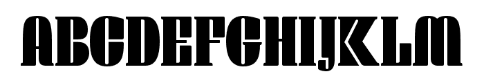
Manometer Serif Extra Light Italic Font
$ Commercial > Adobe.com
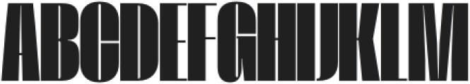
Manometer Serif Extra Light Font
$ Commercial > Adobe.com
Similar fonts for Manometer Serif Low Oblique from MyFonts.com
Monterra Regular Font

$ Commercial > MyFonts.com
Virtuose Extra Bold Italic Font

$ Commercial > MyFonts.com
Similar fonts for Manometer Serif Low Oblique from CreativeMarket.com
Fraget Black otf (900) Font
$ Commercial > CreativeMarket.com
SEBLACK-Bold otf (700) Font

$ Commercial > CreativeMarket.com
![]()
Help your fellow font-seekers if you think you can recognize the font. Earn some good karma by doing it :-) Answer & Help
Yet sometimes the images are very complex, so other users need a bit of help.
If you recognize the font from the samples posted here don't be shy and help a fellow designer.
Thousands of designers (famous or not) use the image font detection system to find a font or similar free fonts from an image. Although we have the largest database of fonts, the search for a font from an image gets mixed results like the image above.