Preview with Your Text


Koning Display SemiBold font
Publisher
MyFonts.com
License
$ Commercial
Date added
Nov 21 2025
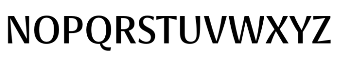
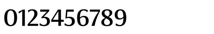
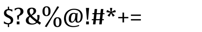
Semi-bold serif display font with moderate contrast and slightly condensed proportions.
A semi-bold serif display font with moderate contrast in stroke thickness, featuring slightly condensed letterforms and distinctive, sharp serifs. The font has a balanced x-height and cap height, with clear ascender and descender proportions, making it legible and elegant.
Editorial headlines, book covers, branding, logos, and sophisticated print materials.
Headlines, Logos, Display text
Download Koning Display SemiBold font.
Editorial headlines, book covers, branding, logos, and sophisticated print materials.
Headlines, Logos, Display text
Category
Bold
Yes
Italic
No
Weight
Width
Condensed
Character spacing
Normal
Line height
Normal
Contrast
Medium
Overall style
Classic with modern refinement
X height
Medium
Cap height
![]()

Help your fellow font-seekers if you think you can recognize the font. Earn some good karma by doing it :-) Answer & Help
Yet sometimes the images are very complex, so other users need a bit of help.
If you recognize the font from the samples posted here don't be shy and help a fellow designer.
Thousands of designers (famous or not) use the image font detection system to find a font or similar free fonts from an image. Although we have the largest database of fonts, the search for a font from an image gets mixed results like the image above.