Preview with Your Text


Koning Display Heavy font
Publisher
MyFonts.com
License
$ Commercial
Date added
Nov 22 2025
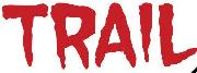
Heavy, bold serif font with condensed proportions and strong presence.
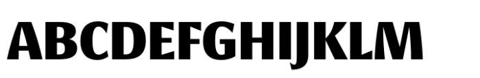
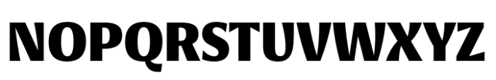
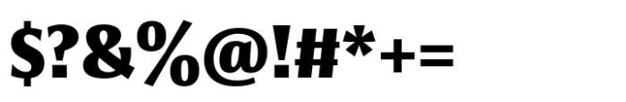
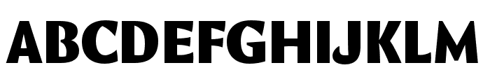
A heavy, bold serif font with strong vertical stress and slightly condensed letterforms. The serifs are prominent but not overly ornate, giving a sturdy and impactful appearance. The characters have moderate contrast in stroke thickness and a slightly compressed width, enhancing the boldness and presence of the text.
Ideal for headlines, posters, branding, logos, and editorial display where strong emphasis is needed.
Headlines, Display text, Logos
Download Koning Display Heavy font.
Ideal for headlines, posters, branding, logos, and editorial display where strong emphasis is needed.
Headlines, Display text, Logos
Category
Bold
Yes
Italic
No
Weight
Bold
Width
Condensed
Character spacing
Normal
Line height
Normal
Contrast
Medium
Overall style
Modern with classic serif influences
X height
Cap height
High
Similar Free Fonts for Koning Display Heavy
MarigeDEMO-Regular Font


$ Free > Personal Use
Marige DEMO Regular Font

$ Free > Personal Use
Similar fonts for Koning Display Heavy from Adobe.com
Queue Black Font

$ Commercial > Adobe.com
Comma Base Ultra Font
$ Commercial > Adobe.com
Similar fonts for Koning Display Heavy from MyFonts.com
Epoca Classic ExtraBold Font

$ Commercial > MyFonts.com
Epoca Classic Bold Font

$ Commercial > MyFonts.com
Similar fonts for Koning Display Heavy from CreativeMarket.com
Cabrito Contrast Cond ExBold otf (700) Font

$ Commercial > CreativeMarket.com
Falige Bold otf (700) Font

$ Commercial > CreativeMarket.com
![]()
Help your fellow font-seekers if you think you can recognize the font. Earn some good karma by doing it :-) Answer & Help
Yet sometimes the images are very complex, so other users need a bit of help.
If you recognize the font from the samples posted here don't be shy and help a fellow designer.
Thousands of designers (famous or not) use the image font detection system to find a font or similar free fonts from an image. Although we have the largest database of fonts, the search for a font from an image gets mixed results like the image above.