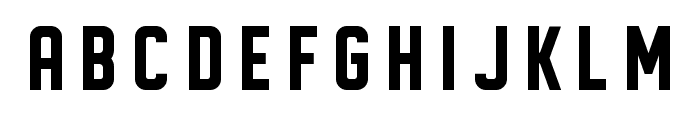
Preview with Your Text


Waite Park JNL Regular font
Publisher
FontSpring.com
License
$ Commercial
Date added
Dec 19 2016
Bold, geometric font with strong, clean lines.
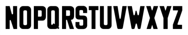
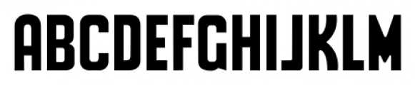
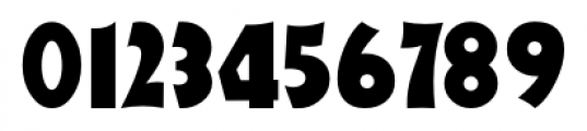
This font features bold, geometric letterforms with a strong presence. The characters are uniformly wide with sharp angles and clean lines, giving it a modern and impactful look.
Ideal for posters, headlines, branding, and signage where a strong visual impact is needed.
Headlines, Logos, Posters
Balanced
Download Waite Park JNL Regular font. Waite Park JNL Regular by Jeff Levine Fonts
Ideal for posters, headlines, branding, and signage where a strong visual impact is needed.
Headlines, Logos, Posters
Balanced
Category
Bold
Yes
Italic
No
Weight
Bold
Width
Normal
Character spacing
Normal
Line height
Normal
Contrast
Low
Overall style
Modern
X height
Medium
Cap height
High
Similar Free Fonts for Waite Park JNL Regular
Wilhelm Regular Font


$ Free > Personal Use
DISPLAYED Font
$ Free > Personal Use
Similar fonts for Waite Park JNL Regular from Adobe.com
Zuume Cut Bold Font

$ Commercial > Adobe.com
Zuume Bold Font

$ Commercial > Adobe.com
Similar fonts for Waite Park JNL Regular from MyFonts.com
Waite Park JNL Font

$ Commercial > MyFonts.com
Sign Production JNL Font

$ Commercial > MyFonts.com
Similar fonts for Waite Park JNL Regular from CreativeMarket.com
Service Station otf (400) Font

$ Commercial > CreativeMarket.com
Areno Rounded otf (400) Font

$ Commercial > CreativeMarket.com
![]()
Help your fellow font-seekers if you think you can recognize the font. Earn some good karma by doing it :-) Answer & Help
Yet sometimes the images are very complex, so other users need a bit of help.
If you recognize the font from the samples posted here don't be shy and help a fellow designer.
Thousands of designers (famous or not) use the image font detection system to find a font or similar free fonts from an image. Although we have the largest database of fonts, the search for a font from an image gets mixed results like the image above.