Preview with Your Text


Should've Known Shaded font
Publisher
FontSpring.com
License
$ Commercial
Date added
Dec 19 2016
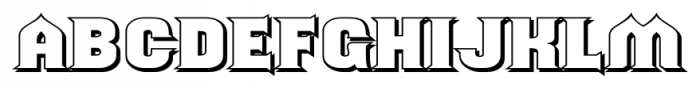
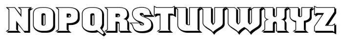
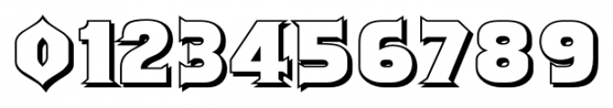
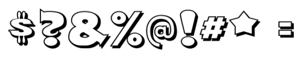
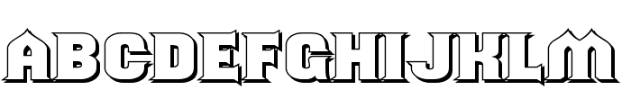
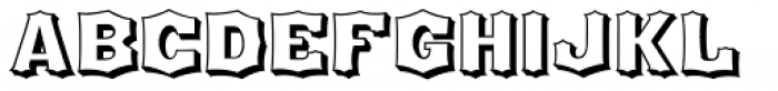
Bold, shaded, three-dimensional serif font.
This font features bold, three-dimensional letters with a shaded effect, giving it a striking and dynamic appearance. The characters are uppercase with sharp, angular serifs and a strong presence.
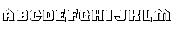
Ideal for posters, headlines, and branding that require a bold and eye-catching design.
Headlines, Logos
Balanced
Download Should've Known Shaded font. Should've Known Shaded by Typodermic Fonts Inc.
Ideal for posters, headlines, and branding that require a bold and eye-catching design.
Headlines, Logos
Balanced
Category
Bold
Yes
Italic
No
Weight
Bold
Width
Normal
Character spacing
Normal
Line height
Normal
Contrast
High
Overall style
Decorative
X height
Other
Cap height
High
Similar Free Fonts for Should've Known Shaded
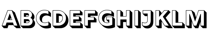
ShouldveKnownShaded-Regular Font

$ Free > Personal Use
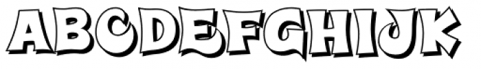
Should've Known Shaded Font
$ Free > Personal Use
Similar fonts for Should've Known Shaded from Adobe.com
Rig Solid Bold Reverse Font

$ Commercial > Adobe.com
Rig Solid Bold Halftone Font
$ Commercial > Adobe.com
Similar fonts for Should've Known Shaded from MyFonts.com
Super Delicious BTN Shadow Font
$ Commercial > MyFonts.com
Houdini Shaded Font
$ Commercial > MyFonts.com
Similar fonts for Should've Known Shaded from CreativeMarket.com
Boxtoon Bold Extrude otf (700) Font

$ Commercial > CreativeMarket.com
Antique X Condensed Shadow Regular ttf (400) Font

$ Commercial > CreativeMarket.com
![]()
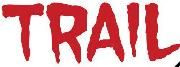
Help your fellow font-seekers if you think you can recognize the font. Earn some good karma by doing it :-) Answer & Help
Yet sometimes the images are very complex, so other users need a bit of help.
If you recognize the font from the samples posted here don't be shy and help a fellow designer.
Thousands of designers (famous or not) use the image font detection system to find a font or similar free fonts from an image. Although we have the largest database of fonts, the search for a font from an image gets mixed results like the image above.