Preview with Your Text


Rieux Minus Regular font
Publisher
FontSpring.com
License
$ Commercial
Date added
Dec 19 2016
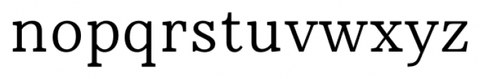
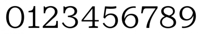
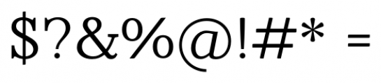
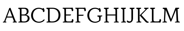
A classic serif font with balanced elegance and readability.
This font features a classic serif style with a balanced and elegant appearance. The characters have a traditional structure with moderate stroke contrast, providing a timeless and readable look.
Ideal for editorial design, book publishing, formal invitations, and branding projects requiring a classic touch.
Body text, Editorial design, Branding
Balanced
Download Rieux Minus Regular font. Rieux Minus Regular by Tetradtype
Ideal for editorial design, book publishing, formal invitations, and branding projects requiring a classic touch.
Body text, Editorial design, Branding
Balanced
Category
Bold
No
Italic
No
Weight
Regular
Width
Normal
Character spacing
Normal
Line height
Normal
Contrast
Medium
Overall style
Classic
X height
Medium
Cap height
High
Proposed projects
Ideal for editorial design, book publishing, formal invitations, and branding projects requiring a classic touch.
Use case
Body text, Editorial design, Branding
Ascender descender ratio
Balanced
Similar Free Fonts for Rieux Minus Regular
CheapProFonts Serif Pro Regular Font


$ Free > Personal Use
Verily Serif Mono Font

$ Free > Personal Use
Similar fonts for Rieux Minus Regular from Adobe.com
Questa Light Font

$ Commercial > Adobe.com
Kopius Extras Labels Font
$ Commercial > Adobe.com
Similar fonts for Rieux Minus Regular from MyFonts.com
Rieux Font

$ Commercial > MyFonts.com
Rieux Light Font

$ Commercial > MyFonts.com
Similar fonts for Rieux Minus Regular from CreativeMarket.com
TA Regresso Easy Text Bold otf (700) Font

$ Commercial > CreativeMarket.com
TA Regresso Easy SemiBold otf (600) Font

$ Commercial > CreativeMarket.com
![]()

Help your fellow font-seekers if you think you can recognize the font. Earn some good karma by doing it :-) Answer & Help
Yet sometimes the images are very complex, so other users need a bit of help.
If you recognize the font from the samples posted here don't be shy and help a fellow designer.
Thousands of designers (famous or not) use the image font detection system to find a font or similar free fonts from an image. Although we have the largest database of fonts, the search for a font from an image gets mixed results like the image above.