Preview with Your Text

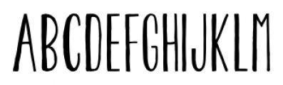
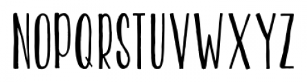
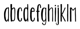
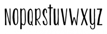
KG Two is Better Than One Regular font
Publisher
FontSpring.com
License
$ Commercial
Date added
Dec 17 2016
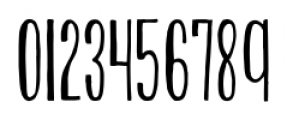
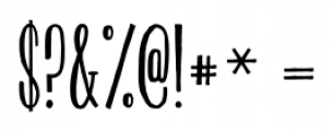
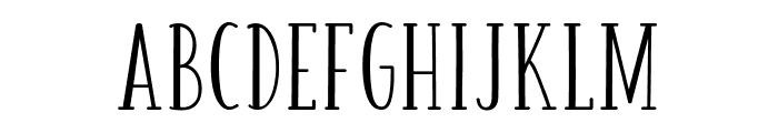
A tall, narrow, hand-drawn font with a playful style.
This font features tall, narrow letters with a hand-drawn aesthetic. The strokes are slightly uneven, giving it a casual and playful feel. The uppercase and lowercase letters maintain a consistent style, with a slight slant adding to its informal charm.
Ideal for greeting cards, children's books, playful branding, and casual invitations.
Headlines, Logos
Moderate
Download KG Two is Better Than One Regular font. KG Two is Better Than One Regular by Kimberly Geswein Fonts
Ideal for greeting cards, children's books, playful branding, and casual invitations.
Headlines, Logos
Moderate
Category
Bold
No
Italic
No
Weight
Regular
Width
Condensed
Character spacing
Normal
Line height
Tall
Contrast
Low
Overall style
Casual
X height
Medium
Cap height
High
Proposed projects
Ideal for greeting cards, children's books, playful branding, and casual invitations.
Use case
Headlines, Logos
Ascender descender ratio
Moderate
Similar Free Fonts for KG Two is Better Than One Regular
KG Two is Better Than One Font


$ Free > Personal Use
HONEY&JAM Regular Font
$ Free > Personal Use
Similar fonts for KG Two is Better Than One Regular from Adobe.com
LiebeErika Medium Font

$ Commercial > Adobe.com
Mezz Std Light Font

$ Commercial > Adobe.com
Similar fonts for KG Two is Better Than One Regular from MyFonts.com
KG Two Is Better Than One Font

$ Commercial > MyFonts.com
Pentathlon Pro Ultra Light Font

$ Commercial > MyFonts.com
Similar fonts for KG Two is Better Than One Regular from CreativeMarket.com
Jiraiya Regular otf (400) Font

$ Commercial > CreativeMarket.com
Honey&Jam otf (400) Font

$ Commercial > CreativeMarket.com
![]()
Help your fellow font-seekers if you think you can recognize the font. Earn some good karma by doing it :-) Answer & Help
Yet sometimes the images are very complex, so other users need a bit of help.
If you recognize the font from the samples posted here don't be shy and help a fellow designer.
Thousands of designers (famous or not) use the image font detection system to find a font or similar free fonts from an image. Although we have the largest database of fonts, the search for a font from an image gets mixed results like the image above.