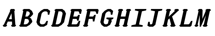
Preview with Your Text


Because of font
Publisher
Envato - graphicriver.net
License
$ Commercial
Date added
Aug 01 2020
A bold, playful script with a vintage flair.
This font features a playful and dynamic style with a slight slant, giving it a lively and energetic appearance. The characters are bold with a moderate contrast in stroke thickness, and the overall design is reminiscent of vintage script styles.
Ideal for retro-themed posters, playful branding, and eye-catching headlines.
Headlines, Logos
Balanced
Download Because of font. Because of by innovasoftbd
Ideal for retro-themed posters, playful branding, and eye-catching headlines.
Headlines, Logos
Balanced
Category
Bold
Yes
Italic
Yes
Weight
Bold
Width
Normal
Character spacing
Normal
Line height
Normal
Contrast
Medium
Overall style
Vintage
X height
Medium
Cap height
High
Similar Free Fonts for Because of
JUstice Mono BoldOblique Font

$ Free > Personal Use
JUstice Mono Oblique Font
$ Free > Personal Use
Similar fonts for Because of from Adobe.com
Fairplex Wide OT Bold Italic Font

$ Commercial > Adobe.com
Fairplex Narrow OT Bold Italic Font

$ Commercial > Adobe.com
Similar fonts for Because of from MyFonts.com
Paradigm Pro Bold Italic Font

$ Commercial > MyFonts.com
Paradigm Bold Italic Font

$ Commercial > MyFonts.com
Similar fonts for Because of from CreativeMarket.com
Craftsman Italic otf (400) Font

$ Commercial > CreativeMarket.com
Portoluce otf (900) Font

$ Commercial > CreativeMarket.com
![]()

Help your fellow font-seekers if you think you can recognize the font. Earn some good karma by doing it :-) Answer & Help
Yet sometimes the images are very complex, so other users need a bit of help.
If you recognize the font from the samples posted here don't be shy and help a fellow designer.
Thousands of designers (famous or not) use the image font detection system to find a font or similar free fonts from an image. Although we have the largest database of fonts, the search for a font from an image gets mixed results like the image above.