Preview with Your Text

The Cons Bold Rounded otf (700) font
Publisher
CreativeMarket.com
License
$ Commercial
Date added
Nov 17 2025
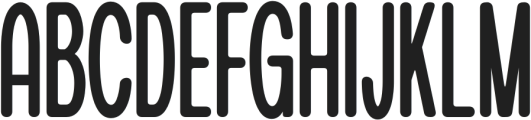
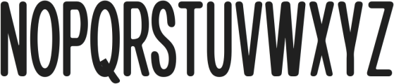
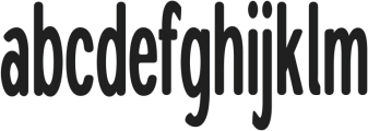
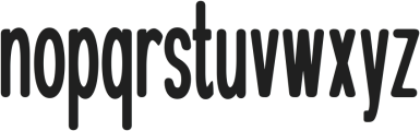
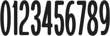
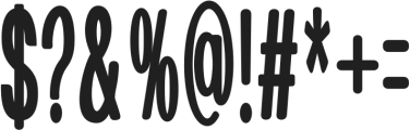
Bold, rounded sans-serif with tall, condensed shapes and smooth curves.
A bold, rounded sans-serif typeface with tall, condensed letterforms and smooth curves. The characters have uniform stroke thickness and a friendly, approachable appearance. The font maintains high legibility even at smaller sizes due to its clear structure and generous x-height.
Branding, packaging, posters, headlines, children’s products, signage.
Headlines, Logos, Posters, Packaging
Download The Cons Bold Rounded otf (700) font. The Cons Bold Rounded otf (700) by afkaristudio
Branding, packaging, posters, headlines, children’s products, signage.
Headlines, Logos, Posters, Packaging
Category
Bold
Yes
Italic
No
Weight
Bold
Width
Condensed
Character spacing
Normal
Line height
Normal
Contrast
Low
Overall style
Modern, Friendly, Decorative
X height
Cap height
![]()
Help your fellow font-seekers if you think you can recognize the font. Earn some good karma by doing it :-) Answer & Help
Yet sometimes the images are very complex, so other users need a bit of help.
If you recognize the font from the samples posted here don't be shy and help a fellow designer.
Thousands of designers (famous or not) use the image font detection system to find a font or similar free fonts from an image. Although we have the largest database of fonts, the search for a font from an image gets mixed results like the image above.