Preview with Your Text


GC under compas Regular otf (400) font
Publisher
CreativeMarket.com
License
$ Commercial
Date added
Nov 17 2025
Traditional serif font with strong, readable letterforms and moderate contrast.
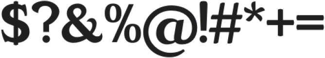
A classic serif typeface with prominent, bracketed serifs, moderate stroke contrast, and a traditional structure. The letterforms are upright with a balanced proportion, featuring a tall x-height and generous counters, making the text highly legible. The numerals and punctuation are bold and consistent with the overall style.
Editorial design, book interiors, academic publications, formal invitations, branding for institutions.
Body text, Headlines, Editorial, Branding
Download GC under compas Regular otf (400) font. GC under compas Regular otf (400) by glyphonictype
Editorial design, book interiors, academic publications, formal invitations, branding for institutions.
Body text, Headlines, Editorial, Branding
Category
Bold
No
Italic
No
Weight
Regular
Width
Normal
Character spacing
Normal
Line height
Normal
Contrast
Medium
Overall style
Classic
X height
Cap height
Proposed projects
Editorial design, book interiors, academic publications, formal invitations, branding for institutions.
Ascender descender ratio
![]()

Help your fellow font-seekers if you think you can recognize the font. Earn some good karma by doing it :-) Answer & Help
Yet sometimes the images are very complex, so other users need a bit of help.
If you recognize the font from the samples posted here don't be shy and help a fellow designer.
Thousands of designers (famous or not) use the image font detection system to find a font or similar free fonts from an image. Although we have the largest database of fonts, the search for a font from an image gets mixed results like the image above.