Preview with Your Text


Why Note Regular font
Publisher
Creative Fabrica
License
$ Commercial
Date added
Jul 31 2025
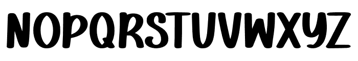
A bold, rounded, and playful font with a casual style.
This font features bold, rounded characters with a playful and casual style. The strokes are thick and consistent, giving it a strong presence. The letters have a slight slant, adding a dynamic feel.
Ideal for children's books, playful branding, posters, and social media graphics.
Headlines, Logos
Balanced
Download Why Note Regular font. Why Note Regular by Copyright (c) 2025 by Craftedtype Studio
Ideal for children's books, playful branding, posters, and social media graphics.
Headlines, Logos
Balanced
Category
Bold
Yes
Italic
No
Weight
Bold
Width
Normal
Character spacing
Normal
Line height
Normal
Contrast
Low
Overall style
Playful
X height
Medium
Cap height
High
Similar Free Fonts for Why Note Regular
Flephy Demo Font


$ Free > Personal Use
Lets Coffee Font

$ Free > Personal Use
Similar fonts for Why Note Regular from Adobe.com
Novecento sans wide Medium Font

$ Commercial > Adobe.com
Novecento sans narrow Medium Font

$ Commercial > Adobe.com
Similar fonts for Why Note Regular from MyFonts.com
Tang Medium SCOSF Font

$ Commercial > MyFonts.com
Popsicle Bandit Thin Font

$ Commercial > MyFonts.com
Similar fonts for Why Note Regular from CreativeMarket.com
Snow Wonder Solid otf (400) Font

$ Commercial > CreativeMarket.com
Enjoy Summer otf (400) Font

$ Commercial > CreativeMarket.com
![]()

Help your fellow font-seekers if you think you can recognize the font. Earn some good karma by doing it :-) Answer & Help
Yet sometimes the images are very complex, so other users need a bit of help.
If you recognize the font from the samples posted here don't be shy and help a fellow designer.
Thousands of designers (famous or not) use the image font detection system to find a font or similar free fonts from an image. Although we have the largest database of fonts, the search for a font from an image gets mixed results like the image above.