Preview with Your Text


Oakters font
Publisher
Creative Fabrica
License
$ Commercial
Date added
Jan 30 2023
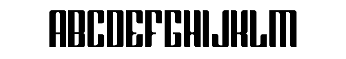
Bold, condensed font with strong vertical lines and minimal curves.
This font features a bold and condensed style with strong vertical lines and minimal curves. The characters are tall and narrow, giving a modern and impactful appearance. The uppercase and lowercase letters maintain a consistent width, enhancing the uniformity of the design.
Ideal for headlines, posters, and branding projects that require a strong and modern aesthetic.
Headlines, Logos
Balanced
Download Oakters font. Oakters by Copyright ? 2022 by Maulana Creative. All rights reserved.
Ideal for headlines, posters, and branding projects that require a strong and modern aesthetic.
Headlines, Logos
Balanced
Category
Bold
Yes
Italic
No
Weight
Bold
Width
Condensed
Character spacing
Tight
Line height
Normal
Contrast
Low
Overall style
Modern
X height
Medium
Cap height
High
Similar Free Fonts for Oakters
Greenleaf Font

$ Free > Personal Use
Brasham Regular Demo Font

$ Free > Personal Use
Similar fonts for Oakters from Adobe.com
Empire Black Font

$ Commercial > Adobe.com
Taurunum Ferrum Iron Font

$ Commercial > Adobe.com
Similar fonts for Oakters from MyFonts.com
Oakters Regular Font

$ Commercial > MyFonts.com
Shtozer 500 Condensed Font

$ Commercial > MyFonts.com
Similar fonts for Oakters from CreativeMarket.com
Oakters otf (400) Font

$ Commercial > CreativeMarket.com
Daimon-Regular otf (400) Font

$ Commercial > CreativeMarket.com
![]()

Help your fellow font-seekers if you think you can recognize the font. Earn some good karma by doing it :-) Answer & Help
Yet sometimes the images are very complex, so other users need a bit of help.
If you recognize the font from the samples posted here don't be shy and help a fellow designer.
Thousands of designers (famous or not) use the image font detection system to find a font or similar free fonts from an image. Although we have the largest database of fonts, the search for a font from an image gets mixed results like the image above.