Preview with Your Text


Brasham Regular font
Publisher
Creative Fabrica
License
$ Commercial
Date added
Dec 18 2019
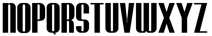
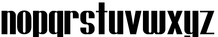
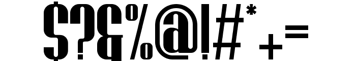
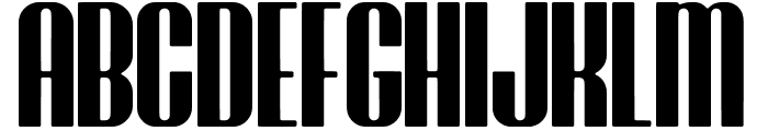
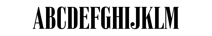
A bold, condensed font with strong vertical emphasis and consistent stroke thickness.
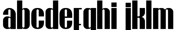
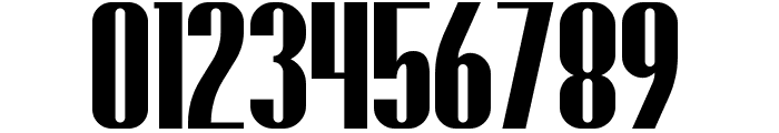
This font features bold, condensed characters with a strong vertical emphasis. The strokes are thick and consistent, giving it a powerful and impactful appearance. The uppercase letters are tall and commanding, while the lowercase letters maintain a similar weight, ensuring uniformity across text. The numerals and special characters are designed to match the boldness of the alphabet, making them stand out.
Ideal for headlines, posters, and branding materials where a strong, impactful presence is required.
Headlines, Logos
Balanced
Download Brasham Regular font. Brasham Regular by Brasham Regular ? Sabrcreative Studio. 2018. All Rights Reserved
Ideal for headlines, posters, and branding materials where a strong, impactful presence is required.
Headlines, Logos
Balanced
Category
Bold
Yes
Italic
No
Weight
Bold
Width
Condensed
Character spacing
Tight
Line height
Short
Contrast
Low
Overall style
Modern
X height
Medium
Cap height
High
Similar Free Fonts for Brasham Regular
Brasham Regular Demo Font


$ Free > Personal Use
Brasham Rounded Demo Rounded Font
$ Free > Personal Use
Similar fonts for Brasham Regular from Adobe.com
Skyline BoldCondensed Font

$ Commercial > Adobe.com
Vincente ExtraBold Font
$ Commercial > Adobe.com
Similar fonts for Brasham Regular from MyFonts.com
Initiate Black Font

$ Commercial > MyFonts.com
Hologram Display Wedge Font

$ Commercial > MyFonts.com
Similar fonts for Brasham Regular from CreativeMarket.com
Brasham Regular otf (400) Font

$ Commercial > CreativeMarket.com
HORMESIS Regular otf (400) Font

$ Commercial > CreativeMarket.com
![]()
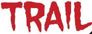
Help your fellow font-seekers if you think you can recognize the font. Earn some good karma by doing it :-) Answer & Help
Yet sometimes the images are very complex, so other users need a bit of help.
If you recognize the font from the samples posted here don't be shy and help a fellow designer.
Thousands of designers (famous or not) use the image font detection system to find a font or similar free fonts from an image. Although we have the largest database of fonts, the search for a font from an image gets mixed results like the image above.