Preview with Your Text


Balancing font
Publisher
Creative Fabrica
License
$ Commercial
Date added
Oct 30 2024
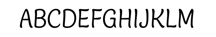
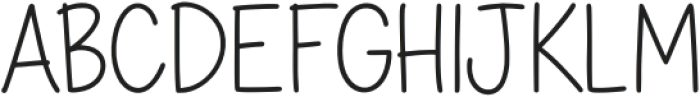
A playful, narrow font with consistent stroke width.
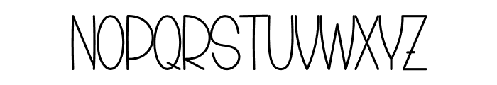
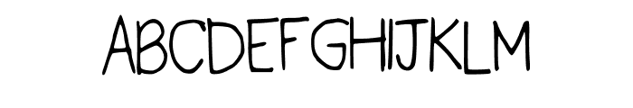
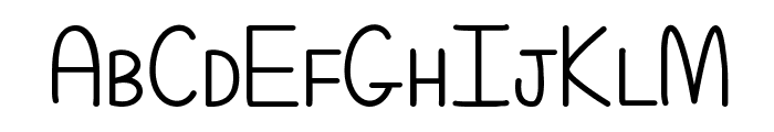
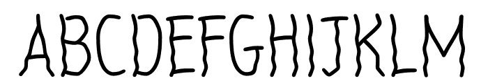
This font features a playful and whimsical style with elongated, narrow characters. The strokes are consistent in width, giving it a clean and modern look. The uppercase letters are slightly taller than the lowercase, with a unique flair in the curves and terminals.
Ideal for children's books, playful branding, and creative posters.
Headlines, Logos
Balanced
Download Balancing font. Balancing by
Ideal for children's books, playful branding, and creative posters.
Headlines, Logos
Balanced
Category
Bold
No
Italic
No
Weight
Regular
Width
Condensed
Character spacing
Normal
Line height
Tall
Contrast
Low
Overall style
Playful
X height
Medium
Cap height
High
Similar Free Fonts for Balancing
Kristine_Pearl Font

$ Free > Personal Use
Even More Mixed Up Font
$ Free > Personal Use
Similar fonts for Balancing from Adobe.com
JTTGattaeeonangirinOTF Regular Font
$ Commercial > Adobe.com
Blanket Light Font
$ Commercial > Adobe.com
Similar fonts for Balancing from MyFonts.com
Delightful Bold Stretch Font

$ Commercial > MyFonts.com
Katelyn Bold Font

$ Commercial > MyFonts.com
Similar fonts for Balancing from CreativeMarket.com
Katelyn otf (700) Font

$ Commercial > CreativeMarket.com
Daily Plans otf (400) Font
$ Commercial > CreativeMarket.com
![]()
Help your fellow font-seekers if you think you can recognize the font. Earn some good karma by doing it :-) Answer & Help
Yet sometimes the images are very complex, so other users need a bit of help.
If you recognize the font from the samples posted here don't be shy and help a fellow designer.
Thousands of designers (famous or not) use the image font detection system to find a font or similar free fonts from an image. Although we have the largest database of fonts, the search for a font from an image gets mixed results like the image above.