Preview with Your Text


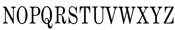
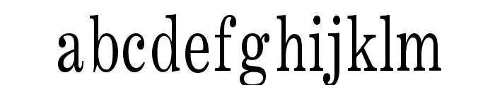
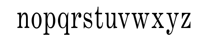


Annual Thin Normal font
Publisher
from Broderbund (included in ClickArt Fonts v5-2009)
License
$ Commercial
Date added
Jan 18 2017
A classic serif font with thin, elegant strokes and balanced proportions.
This font features a classic serif style with thin, elegant strokes. The characters have a traditional appearance with distinct serifs and a balanced proportion. The uppercase letters are bold and prominent, while the lowercase letters maintain a graceful and refined look.
Ideal for formal documents, book titles, and elegant invitations.
Headlines, Body text
Balanced
Download Annual Thin Normal font. Annual Thin Normal by Copyright 1994 Bay Animation Inc. All Rights Reserved.
Ideal for formal documents, book titles, and elegant invitations.
Headlines, Body text
Balanced
Category
Bold
No
Italic
No
Weight
Light
Width
Normal
Character spacing
Normal
Line height
Normal
Contrast
High
Overall style
Classic
X height
Medium
Cap height
High
Proposed projects
Ideal for formal documents, book titles, and elegant invitations.
Use case
Headlines, Body text
Ascender descender ratio
Balanced
![]()

Help your fellow font-seekers if you think you can recognize the font. Earn some good karma by doing it :-) Answer & Help
Yet sometimes the images are very complex, so other users need a bit of help.
If you recognize the font from the samples posted here don't be shy and help a fellow designer.
Thousands of designers (famous or not) use the image font detection system to find a font or similar free fonts from an image. Although we have the largest database of fonts, the search for a font from an image gets mixed results like the image above.