Preview with Your Text


BalboaPlus Gradient font
Publisher
Adobe
License
$ Commercial
Date added
Oct 17 2019
Bold and condensed font with a modern style.
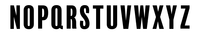
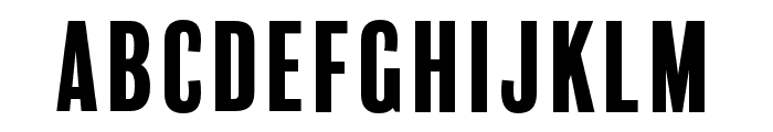
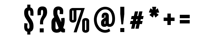
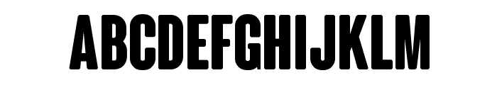
This font features bold, condensed letters with a strong presence. The characters are tall and narrow, giving a modern and impactful look. The strokes are consistent in thickness, providing a uniform appearance.
Ideal for headlines, posters, and branding materials that require a strong visual impact.
Headlines, Logos
Balanced
Download BalboaPlus Gradient font. BalboaPlus Gradient by Adobe Systems Incorporated. All rights reserved.
Ideal for headlines, posters, and branding materials that require a strong visual impact.
Headlines, Logos
Balanced
Category
Bold
Yes
Italic
No
Weight
Bold
Width
Condensed
Character spacing
Tight
Line height
Normal
Contrast
Low
Overall style
Modern
X height
Medium
Cap height
High
Similar Free Fonts for BalboaPlus Gradient
ColunaRounded-CondensedBold Font

$ Free > Personal Use
Brixton_Wood_PERSONAL_USE_ONLY Vector Font

$ Free > Personal Use
Similar fonts for BalboaPlus Gradient from Adobe.com
BalboaPlus Primary Font

$ Commercial > Adobe.com
BalboaPlus Inline Font

$ Commercial > Adobe.com
Similar fonts for BalboaPlus Gradient from MyFonts.com
Balboa Plus Fill Font

$ Commercial > MyFonts.com
Industrial Gothic Std Banner Font

$ Commercial > MyFonts.com
Similar fonts for BalboaPlus Gradient from CreativeMarket.com
CoolClub-Regular otf (400) Font

$ Commercial > CreativeMarket.com
Parkson Bold otf (700) Font

$ Commercial > CreativeMarket.com
![]()

Help your fellow font-seekers if you think you can recognize the font. Earn some good karma by doing it :-) Answer & Help
Yet sometimes the images are very complex, so other users need a bit of help.
If you recognize the font from the samples posted here don't be shy and help a fellow designer.
Thousands of designers (famous or not) use the image font detection system to find a font or similar free fonts from an image. Although we have the largest database of fonts, the search for a font from an image gets mixed results like the image above.