Preview with Your Text


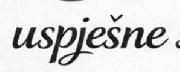
Typography of Coop Condensed font
Publisher
HouseInd.com
License
$ Commercial
Date added
Sep 21 2010
Bold and condensed with a strong, uniform appearance.
This font features bold, condensed letterforms with a strong presence. The characters are tall and narrow, with minimal spacing between them, creating a compact and impactful look. The strokes are consistent in thickness, giving it a uniform appearance.
Ideal for headlines, posters, and branding materials where a strong visual impact is needed.
Headlines, Logos
Balanced
Download Typography of Coop Condensed font.
Ideal for headlines, posters, and branding materials where a strong visual impact is needed.
Headlines, Logos
Balanced
Category
Bold
Yes
Italic
No
Weight
Bold
Width
Condensed
Character spacing
Tight
Line height
Short
Contrast
Low
Overall style
Modern
X height
Medium
Cap height
High
![]()
Help your fellow font-seekers if you think you can recognize the font. Earn some good karma by doing it :-) Answer & Help
Yet sometimes the images are very complex, so other users need a bit of help.
If you recognize the font from the samples posted here don't be shy and help a fellow designer.
Thousands of designers (famous or not) use the image font detection system to find a font or similar free fonts from an image. Although we have the largest database of fonts, the search for a font from an image gets mixed results like the image above.