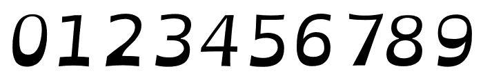
OpenDyslexicAlta Italic font
Publisher
License
$ Free for personal use
Date added
Nov 11 2018
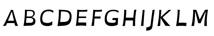
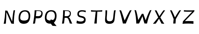
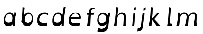
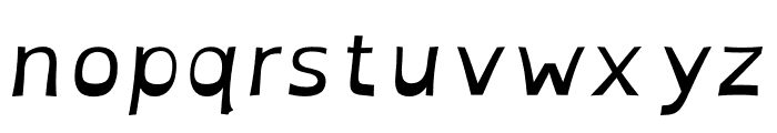
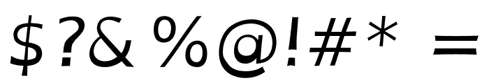
A dyslexia-friendly italic font with a unique, weighted design for improved readability.
This font features a unique design aimed at improving readability, particularly for individuals with dyslexia. The letters have a slightly heavier bottom, which helps to prevent them from being flipped or confused. The italic style adds a subtle slant, giving it a dynamic appearance while maintaining clarity.
Ideal for educational materials, accessibility-focused designs, and any project aiming to enhance readability for dyslexic readers.
Body text, Educational materials, Accessibility projects
Balanced
Download OpenDyslexicAlta Italic font. OpenDyslexicAlta Italic by Original Fonts are © Bitstream. OpenDyslexic changes and additional glyphs by Abelardo Gonzalez are licensed under a Creative Commons Attribution 3.0 Unported License.
Based on a work at http://dyslexicfonts.com. _2012
Ideal for educational materials, accessibility-focused designs, and any project aiming to enhance readability for dyslexic readers.
Body text, Educational materials, Accessibility projects
Balanced
(Abelardo Gonzalez - abbiecod.es)
See the font with your own custom text

Category
Sans-Serif
Bold
No
Italic
Yes
Weight
Regular
Width
Normal
Character spacing
Normal
Line height
Normal
Contrast
Low
Overall style
Modern
X height
Medium
Cap height
Medium
Proposed projects
Ideal for educational materials, accessibility-focused designs, and any project aiming to enhance readability for dyslexic readers.
Use case
Body text, Educational materials, Accessibility projects
Ascender descender ratio
Balanced
Similar Free Fonts for OpenDyslexicAlta Italic
OpenDyslexicAlta Italic Font
$ Free > Personal Use
OpenDyslexicAlta Bold Italic Font

$ Free > Personal Use
Similar fonts for OpenDyslexicAlta Italic from Adobe.com
Chandler42 Lite Font
$ Commercial > Adobe.com
Quiverleaf Arabic CF Extra Bold Font
$ Commercial > Adobe.com
Similar fonts for OpenDyslexicAlta Italic from MyFonts.com
Tric DemiBold Font

$ Commercial > MyFonts.com
Tric Regular Font

$ Commercial > MyFonts.com
Similar fonts for OpenDyslexicAlta Italic from CreativeMarket.com
Tric DemiBold otf (600) Font

$ Commercial > CreativeMarket.com
Tric otf (400) Font

$ Commercial > CreativeMarket.com
WhatFontIs Blog
Fonts for print versus digital: The key differences every designer should know

Latest from the WhatFontIs Forum

Help your fellow font-seekers if you think you can recognize the font. Earn some good karma by doing it :-) Answer & Help
Yet sometimes the images are very complex, so other users need a bit of help.
If you recognize the font from the samples posted here don't be shy and help a fellow designer.
Thousands of designers (famous or not) use the image font detection system to find a font or similar free fonts from an image. Although we have the largest database of fonts, the search for a font from an image gets mixed results like the image above.